Man color space applied color psychology. Color psychology. From the scientific editor
Scientific adviser: Kharchenko Natalya Valentinovna,
additional teacher Education
MBOU Secondary School No. 12 (RS (Y) Mirny)
1. ABSTRACT (3 pages)
2. PROBLEMS AND QUESTION TO BE RESEARCHED: COLOR (4 pages)
3. COLOR EDUCATION (4-6 pp.)
4. ILLUSIONALITY OF COLOR (6-7 pages)
5. EMOTIONAL IMPACT OF COLOR (7-8 pages)
6. LUSCHER TEST (8 pages)
7. TREATMENT WITH COLOR (8 pages)
8. COLOR OPTIONS (8-9 pages)
9. COLOR IN THE DESIGN OF SCHOOLS (DESCRIPTION OF THE SUBJECT OF STUDY) (9-12 pages)
10.CONCLUSIONS (12 pages)
11. REFERENCES (12-13 pages)
Introduction:
Color plays a significant role in the life of a healthy or sick person.
body and is of paramount importance to the human mind.
This is a constantly renewed source of joy.
Leon Daudet
Several years ago, French psychologists asked themselves the question: what colors should school premises be painted in, that is, how does color in school affect the child’s psyche? Scientists from France were not in vain worried when they raised this problem. Today you rarely see dark colors in the interior of a school. But light ones are not always and not always appropriate.
Color can not only decorate, but also spoil the interior. You need to work with interior color very carefully and preferably after familiarizing yourself with the nature of color and the laws of constructing color compositions.
Since school is the place where a child spends most of his time, it is necessary to create the right design in the school space so that the child can not only be focused on learning, but also feel comfortable.
Relevance of the work : In the next decade, our generation will determine the level of well-being of the country, its economic and scientific potential - therefore, one of the important tasks is to create conditions for effective education of schoolchildren. The school's color scheme can help with this, and that's why I think this problem is relevant.
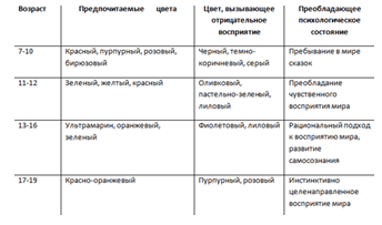
Tasks : 1. Conduct a survey among students to find out the attitude of children towards color, depending on age.
2. Based on this survey, propose a color scheme for classrooms and other school premises: corridors, recreation areas, lobbies. Create a color design for an elementary and high school classroom.
Methods and techniques : study of scientific literature;
Conducting a survey among students in grades 1-4, 5-6 and 10-11;
Questionnaire analysis;
Compilation of material;
Development of office design in Photoshop and CorelDraw.
Data received : survey.
PROBLEMS AND QUESTION TO BE RESEARCHED:
COLOR
Color itself expresses something - from this
You can’t refuse, you have to use it.
Vincent Van Gogh
Man has long noticed the special effect of color on his condition. Color has life-giving and healing powers and is a powerful source of influence on the human psyche and emotional state.
The nature of color, patterns in the field of natural light-color phenomena, features of visual perception of color have long been of interest to scientists from various fields.
Color is the property of light to cause a certain visual sensation in accordance with the spectral composition of the reflected or emitted radiation. Light of different wavelengths excites different color sensations. Color science studies and reveals the basic patterns in the field of color phenomena of nature, the human-created object environment and the entire world of art (those types that are oriented towards visual perception). Color science explains these phenomena, their nature, patterns and features of human perception, and unites sections of knowledge about color into a single system color science.
COLOR SCIENCE
Johann Wolfgang (Von) Goethe was a German poet, statesman, thinker and natural scientist. Goethe is considered the founder of physiological optics and the science of the psychological effects of color. He proposed his own version of the color wheel - a 6-sector one. His circle was formed by three main colors: red, yellow, and blue, located in the corners of an equilateral triangle, between which were the colors obtained by mixing the colors flanking them: purple, orange and green. These colors, like the main ones, are located at the corners of another equilateral triangle, forming a six-pointed star with the first.

Goethe's circle can be used when we need to know a complementary color. This is a color that appears as a halo around the main color. If you look at an orange-red circle on white paper for half a minute, a light blue-green halo will appear around it. If you also peer into a purely red circle, the halo will be almost green. And vice versa: if you look closely at the green triangle, the color of a red peach will immediately appear on the white field. Thus, the order of opposite colors appears in our eyes, since three color substances are reflected in the retina, which cause a mixture of the color tones in question. Consequently, in these experiments, each color, after long and close examination, turns into its opposite. Opposite colors always create sharp contrasts, creating strong, lasting effects. To make the tomatoes look red, you need to place them on green lettuce leaves; if we lay them on red paper, they will appear pale brown.
Observations have shown that each person has his own special relationship to color. Most people have a certain sympathy for some colors and antipathy for others, that is, a person has a whole scale of favorite colors. A person’s scale of favorite colors changes throughout his life. Preschool children prefer red to all others. Children love intense colors much more than adults. Older people prefer gray and pastel colors. Of course, the scale of favorite colors will be different depending on whether it is established based on a survey or visually by showing tables with different colors. Tests with color charts showed that red or blue were chosen first, with red being more attractive than other colors.
This can help us in developing a color scheme for the design of the classroom, classrooms, both junior and senior classes.
Of course, everything that is said here should not be simplified and schematized, but it is still clear that for a child, color plays a big role in his relationship to the environment.
Table 1
An original solution was invented by designers who created an unusual interior design for one of the Australian schools, namely St. Mary's School in the town of Greensboro.
The idea to create a bright, unusual school interior with geometric motifs belongs to the architectural company Smith+TraceyArchitects. Its creative staff is convinced that stimulating children's imagination contributes to children's development, and this is not a myth. They have created the best place from this point of view for children's education.
From a pedagogical point of view, the bright, unusual interior of a school not only helps to stimulate children’s imagination and, accordingly, the growth of learning potential, but also helps to study the environment more effectively. Why? Because the process of learning takes place as a kind of adventure, a game. In the colorful geometric forest, children can play fun games, pretend they are animals or something like that.
Psychologists completely agree with this. Such a bright, unusual, but at the same time non-irritating school interior helps not only stimulate children’s imagination, but also the emergence of positive emotions, which is extremely important in the child’s attitude towards school and in his perception of the educational institution.

Even the wonderful lobby at our school looks unattractive and boring in comparison with this bold decision. I really want to study in such a colorful school.

ILLUSORY OF COLOR
Color is illusory and infinitely variable. Color can visually enlarge or reduce objects, and even affect the assessment of the period of current time. The same color on the walls, ceiling and floor of a rectangular room looks different. By changing, color also changes our perception of the environment. It can influence the interior, visually shorten or lengthen, narrow or expand, raise or lower the room, make the shape heavier or lighter.
In interiors, cold tones should be used to expand the space of rooms, and warm tones to narrow the space of rooms. Blue colors can visually push a wall away if the rest of the walls are a different color. This technique is often used by architects and designers in their practice. In general, highlighting one surface in a room with a rich color is a rather interesting professional move. In this way, you can achieve an unusual illusory transformation of the space of the room. For example, change a familiar room beyond recognition, making it not only beautiful, but also comfortable for living. Here, for example, is an option for distorting space with photo wallpaper, and photo wallpaper creating the illusion of space.


Uniting the surfaces of the walls of a room with color or identical color combinations creates the visual illusion of an expanding space. You need to be careful when using black interior color. Individual inclusions in the form of stripes or spots in combination with white are quite acceptable and can even be very original. Such interiors are preferred by architects and designers themselves. They are a little aesthetic and good for reserved and collected people. In general, white and black color schemes attract with their simplicity and asceticism, although the apparent simplicity of execution is very deceptive.
It is natural for us that a light tone is used in the upper, and not in the lower, part of the room, where heavier tones are appropriate. If the ceiling in the room is painted brown, then it emphasizes that we are fenced off by the surface of the ceiling from the surrounding space. The light yellow floor gives the impression of a yellow sandy beach. The blue floor resembles ice or water. A pink floor seems less walkable than a red or dark green floor.
Thus, painting rooms in certain colors has a certain effect on a person, as shown in the table.
table 2

Following this principle, the walls of a school hallway can be painted in cooler colors to make it appear larger, and children will feel like they have plenty of space to relax, which will help them feel more free.
You can also use not cold shades, but rich, bright shades on the surface of the walls in the corridor, but not in large quantities.

EMOTIONAL IMPACT OF COLOR
Not only scientists (primarily psychologists) and artists, and ordinary people know that different colors and their combinations have different emotional effects on a person and can evoke a wide variety of emotions. Each color carries some information, and the human body reacts to color. For example: red interior color - warm, irritating, stimulates brain function, effective for melancholy and bad mood. It can be used in classrooms, in small quantities in hallways. Orange interior color stimulates the senses and slightly speeds up the pulse, but does not increase blood pressure, creates a feeling of well-being and joy, and increases appetite. Yellow the color of the interior activates the brain, is effective when perceived for a short amount of time in case of mental insufficiency, and lifts the mood. Green the color of the interior has a calming effect on the nervous system and vision, relieves irritability and fatigue.

(Fig. 6 )
Blue interior color - antiseptic, relieves pain. However, if exposed for too long, it causes depression and fatigue. Blue the color of the interior calms, lulls, relaxes muscles, and is effective for insomnia, nervous and physical overload. Violet(purple) interior color has a beneficial effect on the heart, lungs and blood vessels, and increases tissue endurance. Light pink interior color has a powerful calming effect. Relieves stress and has a beneficial effect on the child's nervous system.
All these sensations are based both on the direct properties of color tones, which influence the psychology of people, and on associations, human experience, memory of color perception and identification of any colors with certain objects and phenomena, as well as with the semiotics of color (semiotics is the science that studies properties of signs and sign systems), which has deep roots in centuries-old (and even millennia-old) human culture - material, spiritual, artistic.
People have long attached certain symbolic meanings to certain colors and consolidated them in the culture of a tribe, nationality, nation, and humanity. Since the development of cultures of different ethnic groups occurred over a long period of time in a relatively closed, isolated manner, different semiotic attitudes developed and were consolidated in relation to the same colors in different ethnic groups. Without the associative perception of colors that has developed in human culture, without all the features of the psychology of visual perception of different colors and their combinations, the formation and development of most spatial arts, as well as space-time arts, in the works of which color plays an extremely important role as an active means, would not have been possible. the formation of artistic meanings embodied in certain systems of signs characteristic of certain artistic languages of different types and genres of art.
That is why you need to choose the right color scheme for decorating schools. This is very important for the further formation of the child.
LUSCHER TEST.
MaxLusher is a Swiss psychologist and developer of the Luscher Color Test. His test is based on the experimentally established relationship between a person’s preference for certain colors (shades) and his current psychological state. The use of the test is not limited by intellectual, linguistic, age, or state of the test subject. The test subtly works even with colorblind people and with those who, as it seems to them, deliberately choose not what they like.
TREATMENT WITH COLOR
It has also been known since ancient times that certain color combinations can cause various diseases and, conversely, relieve discomfort. Currently, chromotherapy (color treatment) is one of the popular branches of alternative medicine. Correctly selected shades will help not only restore visual acuity, but also eliminate the manifestations of various eye diseases.
Here are some examples : Red color and some of its shades stimulate the activity of the cardiovascular system, prevent arrhythmia, normalize blood pressure, increase the level of immunity and have a beneficial effect on visual acuity.
Orange color helps get rid of diseases of the respiratory system. It should be remembered that an excess of red and orange tones in the interior contributes to constant stimulation of the nervous system. Yellow color has a beneficial effect on the functioning of the gastrointestinal tract and stimulates the functioning of the pancreas and liver. Green This color lowers blood pressure, relieves stress, eliminates symptoms of fatigue and prevents exacerbation of bronchial asthma.
COLOR OPTIONS
The variety of color possibilities in the composition of design objects:
1.Color, as one of the most active means of composition, primarily affects the aesthetic attitude towards an object before the perception of space, volume, plasticity of form and its details and remains in memory longer than all other features of the form.
2.Color actively forms figurative associations associated with the essence of the object and its cultural and semantic meaning for different social groups and individuals.
3. Color is one of the active means of novelty, originality of composition due to an innovative approach to the use of color, color combinations for an already known object
4. Color is one of the active means of fashion innovation. Fashion introduces certain colors and color combinations into the category of modern, aesthetically and prestigiously valuable during a certain period of the fashion cycle.
COLOR IN SCHOOLS DECORATION
We conducted a survey in which more than 200 students participated. For more productive work, we chose a continuous, face-to-face, group type of survey.
After analyzing the questionnaire data, we can draw the following conclusions:
1) children intuitively choose colors that reflect their emotional needs;
2) the majority of responses to the questionnaire coincide with the recommendations of psychologists on the color design of school premises.
The research data obtained as a result of the work confirm the hypothesis that the color design of classrooms can influence the emotional state of schoolchildren.
We also found out that:
To improve academic performance at school, you need to use the correct design of not only classrooms, but also all rooms.


We have also created a color design option for primary classes, which will have a positive effect on their children’s bodies, and they will be set up to study. Also the design of the corridor and lobby.

We offer the following colors for classroom design.


1 class. If we bring red into the design of classrooms for primary schoolchildren, be it a red panel or a red wall, then we can be sure that this color will have a calming effect on children. Psychologists have noticed that often an excited child, after being shown a red object in the surrounding space, calms down. He will feel confident in this class. A green board (green is a complementary color to red) against the background of a red wall focuses children’s attention on the board and helps visual perception of the course being presented. Thanks to this color scheme, the child concentrates without straining his vision, which helps him perceive the presented material more productively.
2nd grade. As the child grows up, he begins to prefer lighter, softer colors. For second grade students, you can use orange walls. A green board against an orange board will also attract a child's attention, focusing him on his studies.
3rd grade. Following from the same sign, for 3rd grade students you can use soft yellow walls.
6th grade. For older school students, it is appropriate to use an angry color to decorate the walls.
10-11 grade. Scary classrooms can be equipped with a white board and the walls painted in warm pastel colors.
The furniture in the classroom should not contrast with the walls, so as not to distract from the semantic center of the room - the board: it is on it that children's eyes are directed during a long school day. The white chalk writing on the black board is hard to see. The brown board puts you to sleep. The best option is a dark green board: against its background, inscriptions made with yellow and orange crayons are best read. Stands, a cool corner where all kinds of information is placed, cool newspapers - something also depends on the color of these details in the interior.
Fortunately, now we can easily use modern materials, which make it possible to change exhibitions in the school space quite often and without much expense, with the help of which we can make those places in our school where we would like to return again and again.
CONCLUSIONS.
Based on our own experience and studying the literature on the problem, we can do the following: conclusions:
Color affects the human body; different colors have different effects on our emotional state. There are active colors, stimulating the emotional state or calming, there are colors that we reject;
Acceptance or rejection of color often depends on the age of the child;
The most acceptable colors for school design are yellow, orange, green;
We found out which colors have a beneficial effect on the human body, which colors are best used when decorating school interiors.
Bibliography:
- Alyokhin A.D. “Fine arts: artist, teacher, school. A book for teachers" - M.: Education, 1984.
- Kandinsky, V. “On the spiritual in art” / V. Kandinsky. - M., 1911.
- Luscher, M. Luscher color test / M. Luscher. - M.: AST, St. Petersburg. : Sova, 2005.
- Mironova, L. “Color Science” / L. Mironova. - Minsk: Vysh. school, 1984.
- Mironova, L. “Color in fine arts” / L. Mironova. - Minsk: Belarus, 2002.
- "Psychology of artistic creativity." - Minsk: Harvest, 1999.
- “Man-color-space. Applied color psychology" Heinrich Fling, Xaver Auer. Per. with him. M., Stroyidat, 1973
- Kovalev A.F. “Fundamentals of school decoration” Minsk, 1974.
- Ponomarkov S. I. “Decorative and design art at school” M.. 1976.
- Solovyov S. P., Astrova T. E. “Color in the interiors of secondary schools” M., 1978.
- Fundamentals of design S. Mikhailov, L. Kuleeva “New Knowledge” Kazan 1999
- "Space and Light in the Modern Interior" by Catherine Sorrell. Kladnz - Books, 2007.
- “Color harmony of colors” publication “Our Home” Advice from professionals.
- “Color science and coloristics” V. Yu. Medvedev “St. Petersburg State University of Technology and Design” 2005.
- “Color psychology and color therapy for everyone” G.E. Breslav 2003
- “Color science” O.I. Denisova Kostroma 2006
- G. Waterman “Design of your apartment”, Moscow, ed. "Falken", 1992, p.125.
- M.K.Prette, A.Capaldo “Creativity and Expression”, Moscow, ed. "Soviet Artist", 1985, p.203.
![]()
Man - color - space: Applied color psychology / Heinrich Frieling, Xaver Auer; Abridged translation from German by O. V. Gavalov. - Moscow: Stroyizdat, 1973. - 117 p., ill.
The book systematizes the practice of color design for workshops, schools, hospitals, restaurants, canteens, hotels, residential and other premises based on color psychology. The effect of color on the human body under different conditions is shown. Theoretical and practical achievements are outlined, on the basis of which a color designer can solve the tasks assigned to him. The text is supplemented with color illustrations.
The book is intended for architects, graphic designers, safety workers, and managers of production enterprises.
FROM THE SCIENTIFIC EDITOR
The book by G. Frieling and K. Auer “Man - Color - Space” is of some interest to a wide range of Soviet readers. This is explained as follows. Color is the oldest reality of human existence. The diversity of this reality has long been mastered and assimilated by the theory and practice of human experience, turning the secrets of the world of color into knowledge about it.
The book by G. Frieling and K. Auer is a meaningful experience in such a mastery of color diversity, this time reflected in the mirror of color psychology.
The scope of consideration of this experience is determined by the very title of the book. Therefore, the problems of the book may find a special response among those readers who, through their profession, transform existing or create new color designs, materializing in their practice the connections: man - color, man - space, space - color.
Architects, designers, artists who solve complex problems related to the color climate of the city, industrial and public interiors, exhibition ensembles, etc., will become familiar with some aspects of color dynamics and color psychology.
Does the book answer all the questions that may arise when considering the connections indicated by the authors already in the title of the book “Man - Color - Space”? No, he doesn't answer.
The authors do not undertake such obligations, framing the topic with the subtitle: “Applied color psychology.” And here we should draw the attention of readers to the main concept of the authors, which can be formulated as follows: transpolation of the color patterns of living nature to artificial, man-made nature.
This concept in itself is of undoubted interest, but its direct projection onto design practice often requires a careful attitude to the authors’ advice on organizing a color-dynamic environment. And that's why. By assigning certain static spatial characteristics to each color, unambiguously assessing the figurative capabilities of each individual color under consideration (and we rarely come into contact with one color, but always with color relationships), the authors deprive design as an activity of its main pathos - the pathos of creating new color values, new emotional impressions that have aesthetic roots in the most artificial nature.
This is not a criticism of the author’s position, it is a doubt about the possibility of solving design problems only on the basis of color psychology data (of which the authors are often convinced), because the modern design worldview is focused primarily on the diversity and ambiguity of the environment surrounding a person.
Agreeing with this statement, we must agree that the starting point in the formation of an artistically developed environment is the design concept. He, and only he, ensures the compositional and color integrity of this environment, its visual content, in which the data of color psychology must certainly find their very important place.
The absolutization of the symbolic, iconic properties of color is also not convincing, since they are considered by the authors outside of specific cultural and historical traditions, outside of specific geography.
The authors' understanding of connections: material - color as static connections seems somewhat outdated, since the scientific and technological revolution daily breaks the habituality of stable ideas about the inseparability of these connections.
The scientific and technological revolution today poses tasks for design consciousness that are often incompatible with the color patterns established by the authors, with the authors’ orientation towards the color values of living nature as the only source of creativity, as the only standard of color formation (where nature appears to the authors rather as a static color model ).
But in order to solve these problems posed by time using professional means, knowledge of such patterns is necessary, because when breaking patterns, you need to know what and in the name of what you are breaking. Their book is mainly devoted to the consideration and definition of these patterns (and in this part of the book the authors are extremely thorough).
The authors’ understanding of the role of color in the production environment, not only as a factor that increases labor productivity, but above all as an element of culture, as a vital necessity of human existence, also looks very attractive.
Nature has always given man an endless range of color experiences. Mastering and mastering them is an urgent sociocultural task, designed for the collective efforts of representatives of different professions. In solving this problem, the book offered to the reader by G. Frieling and K. Auer “Man - Color - Space” will also take a certain place.
PREFACE
The present work is based on experimental material from the Institute of Color Psychology in Markvarstein (director Dr. Freeling) and the Color Center in Zurich by K. Auer. This material consists of the results of our own research into the psychological connections between humans and colors, as well as a wealth of practical experience.
It is hoped that this book will be useful not only to engineers and production managers, but also to artists and architects.
For the opportunity to collect existing experience, we are primarily grateful to those industrial enterprises and special organizations whose interest in color psychology was reflected in practice. We thank everyone who helped speed up this work, and first of all our employees G. Bonzels and K. Görsdorf, as well as Perry Martin, Södertälje (Sweden).
We publish this work with the caveat that further research and substantiation of the proposed provisions are necessary.
Let our book draw attention to the area which allows the correct use of color to achieve the satisfaction of the requirements of social life, provided that super-mechanical rationalization is avoided.
From the scientific editor. 5
Preface. 8
1. MAN AND COLOR.. 9
Systematization of colors. 9
Interesting experiments... 10
Favorite colors... 12
Color perception... 13
Unusual banquet...14
Review of natural colors... 15
Black roses and yellow coal.. 16
Color dynamics.. 17
2. LIGHT AND COLOR. 20
The effect of color on the body. . . . 20
Light and dark... 21
Contrasts of warm and cold... 22
Living circle of flowers.. 23
Color contrasts. 24
Color reflexes.. 25
If you fully distinguish colors, you can safely use the services of a color psychologist. As is known, up to 8% of men and less than 0.5% of women on the planet suffer from varying degrees of color blindness (for example, inability to distinguish between red, blue and/or yellow (less often, a complete lack of color vision). Everyone else is significantly lucky to enjoy the color gamut. In Japan, for example, great attention is paid to the names of colors and undertones.One of them was named after Rikyu, the man who created a new type of tea ceremony.
From time immemorial, man has striven to subjugate the gifts of nature - Earth, Water, Fire and Air. Color began to correlate with the seasons (according to the Tibetans, the color of the Moon plays an important role: in winter - white, in spring - red, in summer - golden, in autumn - dark green), natural phenomena, times of day and even parts of the body.
The young science of color psychology owes its appearance to Dr. Mark Luscher, who in the late forties of the last century developed a psychological color test based on the subjective perception of color. The test is a ranking of colors by subjects based on personal likes and dislikes, without taking into account fashion and generally accepted tastes. At the end of the test, the person is told how to avoid psychological stress and the symptoms it leads to.
Even the French poet Arthur Rimbaud painted vowels in colors, the composer Rimsky-Korsakov saw the color of musical tones, and the composer Alexander Scriabin saw the color of musical notes. If you ask what color letters or numbers are associated with, you will probably immediately or gradually have images.
Preferred colors for peace of mind at home or for efficiency in office premises are recommended by both Feng Shui masters and interior decorators. For example, you should use red with caution, as too much of it can cause aggression or a feeling of danger. The same applies to the color white, which, despite its ability to visually expand space, puts pressure on the psyche and leads to depression.
Psychologists determine a person’s mood and inclinations both by clothes and by car, while astrologers name color preferences even by Zodiac Signs.
In general, wherever you look there are tests and conclusions. The human eye is limited in its perception of color. People don't see the shades of brown that a horse sees and the shades of white that a polar bear sees - we don't need to. Nature has endowed different creatures with either special vision or a special perception of reality.
- Red associated with love, beauty (a red maiden means beautiful), passion, royalty, aggression, etc. Red color is preferred by cheerful, emotional, decisive, and courageous people. This is the color of the planet Mars, therefore, belligerence, sincerity of intentions and a thirst for adventure are inherent in the character of a red lover. If you need determination, surround yourself with red things and all your problems will seem easily solvable.
- Blue color is associated with mystery, peace, stability, depth. Blue is related to black - a deep shade of indigo can lead to depression, and blue, on the contrary, is the color of carelessness and hope. Blue lovers feel the need for solitude, peace, and self-sacrifice. If you are subject to frequent mood swings or illnesses, this color will balance the nervous system and give strength. The planet of this color is Venus. Previously, girls, not boys, were dressed in blue. This is a note for young parents.
- Yellow the color is complementary to blue. Maybe that’s why he earned opposite meanings: life and death according to Chinese ideas, joy, fun and separation, deception, illness. Those who love yellow are inherently adventurous. These are open and cheerful people. Yellow can increase self-esteem and also fight excess weight.
- Green consists of blue and yellow colors, therefore it combines the qualities inherent in both. This is a symbol of the new, freshness, youth, success, permissiveness. But it is also called motionless. Only the green color is called evergreen - as a symbol of stability (maybe it’s not for nothing that money is printed in this color?). The color promotes performance (which does not appear quickly), so it is undesirable in the bedroom. In a green corner, the nervous system is quickly restored. Having chosen the shade you like (light green, turquoise, olive or another), know that the darker the color, the stronger the depressing effect it has on the psyche.
- White, on the one hand, the color of purity (snow, hospitals), innocence (brides), virtue (saints). But also cold (like an iceberg), since it absorbs all colors. By the way, it is better to use white in the house in combination with other colors, since in its pure, undiluted form it can not only even out the mood, but also cause a feeling of fear. This is probably why alchemists were sad about the color white, and most contemporaries have a negative feeling towards hospitals and doctors. In China and Africa, as well as among the ancient Slavs, it is the color of mourning. Now the Slavic peoples consider white to be the color of celebration and joy.
- Black in Japan it is the color of joy, and in Western culture it is the color of mourning, sorrow, sadness. Black represents mystery, darkness of the night, sin and repentance. This color absorbs others and is endowed with a certain mystical power (black holes, black magic, etc.). Those with black eyes are considered envious. But mostly these are prejudices. Without black there would be no high fashion, contrast and visual slimness of the figure, and this already instills joy in the hearts of many women!
The so-called intermediate colors consist of two primary colors. So they absorb the features of two: orange - between red and yellow, pink - between red and white...
Psychologists say that a topic such as color psychology is now gaining popularity. It turns out that a favorite color can tell a lot about a person and his aspirations. Don't believe me? So let's check it quickly.
Yellow
This color is chosen by people who have a well-developed imagination and excellent outlook. In most cases, they are pedants; they like all things to be in their place, and all events to occur in a clear sequence. What will make them stand out from the crowd is their unique sense of humor and eyes filled with optimism.
Red
 Red color is adored by passionate people. Life without change and adventure seems boring to them. These people are extremely hot-tempered, but after a few minutes, not a trace remains of their anger. Often such people become the “soul” of the company. They come across as purposeful and strong individuals.
  Grey
Grey
A person who chooses this color is reliable in everything. You can rely on him in any situation, even the most delicate and difficult. Such a person is often a support not only for his chosen one, but also for all his relatives. He is not a fan of controversy and noisy companies; he feels great alone.
Brown
 Few people prefer this color. But, if your favorite color is brown, you are a hardworking, sincere, patient and deeply decent person. But at the same time, you are a person with a complex character, capable of subtly perceiving reality. You are somewhat impressionable and vulnerable, so you react sharply to criticism addressed to you.
  Violet
The color purple and all its shades are chosen by creative people. In addition, this color indicates that a person is not inclined to obey established canons. Lovers of the color purple are good comrades, they will help a friend out of any trouble, you can always count on them.
Orange
 This color is liked by cheerful and active people who not only know how to discern opportunities, but also realize them brilliantly. However, these people are sometimes prone to exaggerating trifles and dramatizing situations occurring in their lives. They are always in the midst of events and in the center of attention of others.
  Green
Green
The color of calm and creation. He is preferred by people with a complex, intractable character and strong life positions. These people are most often intellectuals who like to talk about philosophical topics. They have a leadership spirit, so they are able to lead people.
Blue
 People who prefer blue color most of all want to achieve harmony in life. Moreover, this applies to all areas - love, business, health, career, finance, personal relationships. Also, these natures are loyal and demanding not only of themselves, but also of their loved ones. They do not accept insincerity, flattery and hypocrisy. Another distinctive quality of blue lovers is conservatism; it is not easy for them to get rid of existing stereotypes. But they are disciplined and know how to control their actions, thoughts and words.
  Black
Black
Many psychologists are sure that black is the color most often chosen by mysterious people. And sometimes even their closest people cannot understand what is going on in their souls. They often keep their distance from everyone around them. Also, the choice of black speaks of excellent taste and elegance.
White
 Symbolizes purity, hope and perfection. This color is preferred by sincere people who adhere to order in everything, from their own thoughts to their appearance. They look at the world through the prism of justice and cannot stand aside if someone is unfairly offended. These people are “warriors” who will always defend the rights and interests of the humiliated and insulted.
Sometimes people cannot give preference to a single color; they like several colors at the same time. This phenomenon is quite natural and can be easily explained. The fact is that these natures constantly change depending on the specific situation, which makes them even more mysterious and attractive to others. This is color psychology in action!