When to Use White Text on a Dark Background
Many websites use black text on a light background because it is easy to read. However, white text on a dark background can also have its benefits. Knowing when to use one of the solutions will help make your projects better.
Reading or scanning?When it comes to text on a website, users read or view (scan) the text. Reading is an emphasis on words to think thoroughly about a subject. Scanning involves reading words to gain a broader understanding of a subject. When you should use white text on a dark background depends on whether users read or scan the text.
Paragraph textThe type of text that users read is paragraphs. Because users read paragraphs, you should avoid using white text on a dark background when displaying paragraphs. Forcing users to constantly look at white text can be hard on the eyes. This is because white stimulates all three types of color-sensitive visual receptors in the human eye. Reading white text on a dark background is stressful on the eyes.
White also reflects light of all wavelengths. Therefore, the words and letters in a paragraph of text are compact and close to each other. When a piece of paper reflects light, the light scatters and spreads to nearby words and letters. The black background makes the shapes of the words and letters difficult to see. Compare the black text where it absorbs the light around each word and letter, making them seem to stand out.
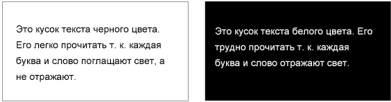
This is why the best choice for displaying paragraph text is black text on a light background with a shade of gray. Not on a white background. Less light will be reflected behind the words, making it easier on the eyes. Black text works better because... black is also a color that . Thus, the color black does not put much strain on the eyes since it absorbs the light that hits each one.
However, if your site must use a dark background to display the main text, use gray. This will not strain the user's eyes because gray text is not as bright as white text. It will reflect less light, making it easier to read. Keep in mind that if you are reading text in a dark room where there is no light present, then white text on a black background is not that difficult to read. This happens because the light does not reflect from it in a dark room.
 Sections, titles and headings
 There are times when white text on a dark background is appropriate. These moments are when the user scans the text with his eyes. Users typically scan headlines, titles, and author. Using white text on a dark background for these types of text is an effective way to make them stand out to grab the user's attention. After all, it's white. This makes the text bright and legible. You won't have to worry about eye strain because scanning these types of text doesn't require visual fixation. This is all just a quick glance or check of the title, title or category.

Using white text on a dark background as a highlighting tool is a smart way to show important elements that users often miss. By applying this rule on your website, you will make the text easy to read, without harming the eyes of visitors.
What I don’t like about Chrome is the flickering of the white background when drawing a page. As far as I understand, this happens at the engine level, and cannot be changed at the user level, even if you change the colors in the OS. I think that at this point we need to throw a stone at the Chrome developers. Why do they determine the color of the canvas themselves, and not take it from the OS system settings? The same goes for Skype and a number of other “serious” applications.
Opera Opera is not so dense. All we could find was the Contrast Changer extension. Or a simpler option in the form of bookmarklet.As an alternative to Clearly, you can use the online service Instapaper and their bookmarklet.
Also, the Stylish extension has recently appeared.
Selecting a dark theme. For example, Opera Simple Dark.
alternative to Stylish
Text editorMicrosoft Word 2010before and after


To change the interface color:
File > Options > General > User Interface options > Color Scheme: Black. To change the color of the paper (background), you need to change the colors in the OS.
I can't help you with older versions of Office.
Another bonus of “white on black” for mobile devices is that this combination consumes less energy (because it emits less light). How much less? Don't know. I suspect that with prolonged reading it is quite noticeable. It would be interesting to see the statistics.
Visual Hygiene Contrast As mentioned above, do not use too much contrast (max white on max black). Contrast ≠ readability. Light gray on dark gray is perceived more comfortably. Which gradation of gray is selected individually.Contrast plays a role not only in the image on the display, but also with the world around you. That is, take into account the lighting in the room and try to avoid too much contrast between the lighting and the brightness of the display/colors. This is especially true for night owls. If you already work in the dark, switch to dark color schemes - your eyes will be much less tired. The contrast between a dark and light theme in a dark room can differ by 20 times or more!
Distance Don't forget about the inverse square law. If you are used to leaning towards the monitor, then when reading, increase the font size ( Ctrl+) and lean at least 15cm more back. This will significantly reduce the amount of light emitted to the eyes. Of course, the monitor has too large an area to consider it a point light source and apply this law to it. But as a simple example shows, when the ambient light is not too bright, leaning back from a distance of 55cm to 75cm, the illumination from the monitor decreases by 1.5 times (and even more in the dark). The recommended distance from the monitor is 50-70 cm. Breaks Regular breaks from working at the monitor are more beneficial for vision than all of the above combined. But how does one remember to take regular breaks?I absolutely loved the Workrave app. Adjustable for different time intervals and pauses of different lengths (for example, 3 short ones every 15 minutes, 1 long one every hour). It can block the system for a certain time without the possibility of canceling, which is very motivating to get up from your desk :) It has many little conveniences in the settings. For example, a few seconds before blocking, a warning pops up, and if you are too busy and don’t have time to pause, then you just continue working - the application will notice the activity (keyboard, mouse) and cancel the blocking. It also independently determines when you take a break and resets your timer.
Exercises I suspect that most readers are familiar with the symptoms of computer vision syndrome such as spasm of accommodation (pseudomyopia, false myopia) or dry eye. There is enough information on the Internet on how to prevent these disorders through various exercises and gymnastics for the eyes. The main thing is to do them regularly, at least several times a day. I would like to separately mention 2 types.Human vision is designed in such a way that the normal state of the eyes (when the eye muscles are relaxed) is accommodation into the distance. Because the monitor is normally located relatively close to the eyes, the ciliary muscle is constantly tense to keep the lens convex for close focusing. This leads to fatigue and spasms of the ciliary muscle (pseudomyopia), and over time to permanent visual impairment. Alternately looking far and near compensates for this tension, for which you definitely need to break away from the monitor (which Workrave helps well) and periodically exercise at the window for a few minutes.
The second type is face palming.
face palming

Yes, yes, that's it. So every time you react to an epic fail, you have the opportunity to stretch your eyes. This method is also known as palming. There is still a lot of speculation and controversial personalities surrounding this word. Therefore, I will immediately make a reservation that I recommend this exercise not as a method to improve vision, but as a method to relax the eyes. Darkness gives the photoreceptors the opportunity to “rest”, and the warmth of warm hands dilates the blood vessels of the eyes and stimulates blood circulation. It will also moisten the eyes, since for some reason a person blinks much less when working at a monitor. Well, considering that the brain spends most of its energy on processing visual information, this is also a way to relax the gyrus a little.
(house) and without lighting (at night). Daylight was excluded because the result strongly depends on many factors (for example, weather) and has a large scatter in measurements.
Distance . For the long distance I took the length of my arm to be 75 cm. For the short distance - a slope of ~20 cm forward closer to the monitor.
Display brightness. In conditions without lightening, I carried out measurements twice - with the maximum brightness of the display and, accordingly, with the minimum.
Measurement results. I compiled all the data into one table. For comparison, I used the ratio between illumination in different conditions. As can be seen from the table, with “average” lighting, leaning back, the illumination decreases by 1.5 times. And in the dark, if you use a dark scheme, then the illumination decreases by 25 times.
Disclaimer! The results of the experiment do not claim to be universal, since the experiment was done “on the knee”. But I dare to assume that similar results will be observed in many everyday situations.
vision
The holiday is approaching - International Women's Day. Let's prepare for it in advance. You can congratulate girls and women in an original way by using the postcard services discussed below.
 Create a postcard for March 8 online
 Use the following services to create a postcard practically from scratch.
I hope that by using one of these generators, you will be able to adequately congratulate your ladies on March 8th!


The content of the article:
Google Plus is being closed The Google Plus platform did not live up to the hopes of the developers and will be completely removed on April 2, 2019. Along with it, the albums associated with it in Google Photos will disappear, and authorization on sites with a Google Plus account will become unavailable. As of February 4, the function of creating Google Plus profiles, channels and pages has become unavailable. If valuable content was stored on your account, then you can download a backup copy.The changes will most affect bloggers who run their blogs on Blogspot. Some G+ widgets, G+ comments, and your Google + profile will no longer be available. This is stated in the notification in the Blogger admin area:
Following the announcement that the Google+ API will be decommissioned in March 2019, a number of changes will be made to Blogger's integration with Google+ on February 4th.
Google+ Widgets. Blog designs will no longer support the +1 Button, Google+ Followers, and Google+ Badge widgets. All instances of these widgets will be removed from your blog.
+1 buttons. The +1 and G+ buttons will be removed, as will the "Publish to Google+" links under blog posts and in the navigation bar.
Please note that if you are using a custom template that has Google+ features, it may need to be modified. Please contact the person who provided you with this template for recommendations.
Google+ Comments. Support for comments using Google+ will be discontinued, and all blogs that use this feature will be restored to standard Blogger comments. Unfortunately, comments posted via Google+ cannot be transferred to Blogger, so they will no longer appear on your blog. Deleting Google Plus comments Unfortunately, comments that were published in the system will be deleted permanently. You can only use the same tool https://takeout.google.com to say backup comments from Google+ to your computer. Only there is no bootloader for it and you can only restore comments manually in a rather crooked way. It’s good that I was on time. How to replace a Google Plus profile with a Blogger profile If you blog on Blogspot, then it is advisable to now return from the Google Plus profile to the Blogger profile (for those who switched to Google Plus at one time). I recommend doing this right now to avoid unexpected situations that may occur when deleting Google Plus accounts. How to get your Blogger profile back. This is easy to do in the Blogger admin settings:
Settings –> User Settings –> User Profile – here select Blogger

Save your changes.

Confirm the transition to and enter your name or nickname.

Don't forget to upload an avatar on your Blogger profile.
How to delete a Google Plus profile If you decide to get rid of your G+ profile once and for all, then go to your Google Plus page -> Settings -> scroll to the bottom of the page -> delete Google Plus account:

Today I’ll tell you what CSS3 is, what it’s used with, where to look for it, and how to write it correctly. I warn you, I will tell from myself, simplified for the general public, as I see it + examples. So, let's start from afar.
CSS are styles in which the properties of an object are written. This means that they are in all existing engines, if you cannot find them, then either you are looking in the wrong place, or they really do not exist ( crooked site). Where are they usually found? Usually this is the root of the site, the name of the style.css file, although, in principle, the name is not as important as the .css extension if the file with such an extension is a style file.
See also on my blog.